Meet Yago, your business partner on WhatsApp
Meet Yago, your business partner on WhatsApp
Dec 10, 2025
💳 Before They Abandon the Cart: 10 Steps to Close More Sales
Improve your checkout to reduce abandoned carts and convert more visits into sales
Silvana Cabrera
In a physical store, the sale is decided at the checkout. In an online store, that moment occurs at the checkout, where the customer confirms their order and makes the final decision to pay.
You can invest in traffic, ads, influencers, and branding, but if this section does not work well, all that effort ends up in abandoned carts. When a person reaches the payment section, it means they have overcome all the difficult parts: they found your store, compared options, and decided what they want to buy. If they abandon right there, you are not just losing a visitor; you are losing someone who was ready to become a customer.
Various sources estimate that between 65 and 85% of online store traffic ends in abandoned carts. On average, seven out of ten people who visit an online store do not complete their purchase. You can see variations by industry, country, and payment method, but the conclusion is the same: abandonment on the payment page represents thousands or millions in lost sales every year.
The good news is that with good practices and specific adjustments to your payment process, you can significantly reduce that abandonment. It all starts with understanding where people leave, why it happens, and what you can optimize so that more visitors reach the “order confirmed” button.
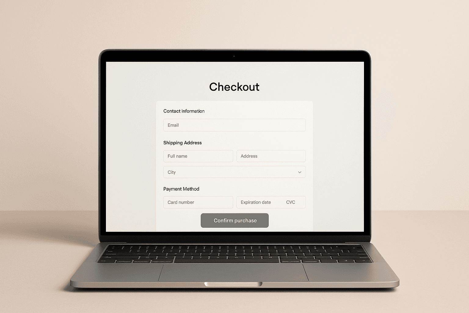
🧾 What is checkout in your online store
Technically, the checkout is the page or set of screens where the customer completes the purchase. From a business perspective, it's the final stretch of the journey before the money reaches your account.
In an online store checkout, the following typically appear:
Personal and contact details
Shipping address
Delivery options
Payment methods
Order summary (selected products)
Confirmation button and success screen
In a physical store, it would be the checkout counter. The customer has already chosen the product, advanced with the cart and only needs to pay.
The difference is that in the digital environment you don't see the line, you don't see the person hesitate, you don't see them turn around and leave. You only see the conversion rate not rising and your abandoned cart rate remaining high.
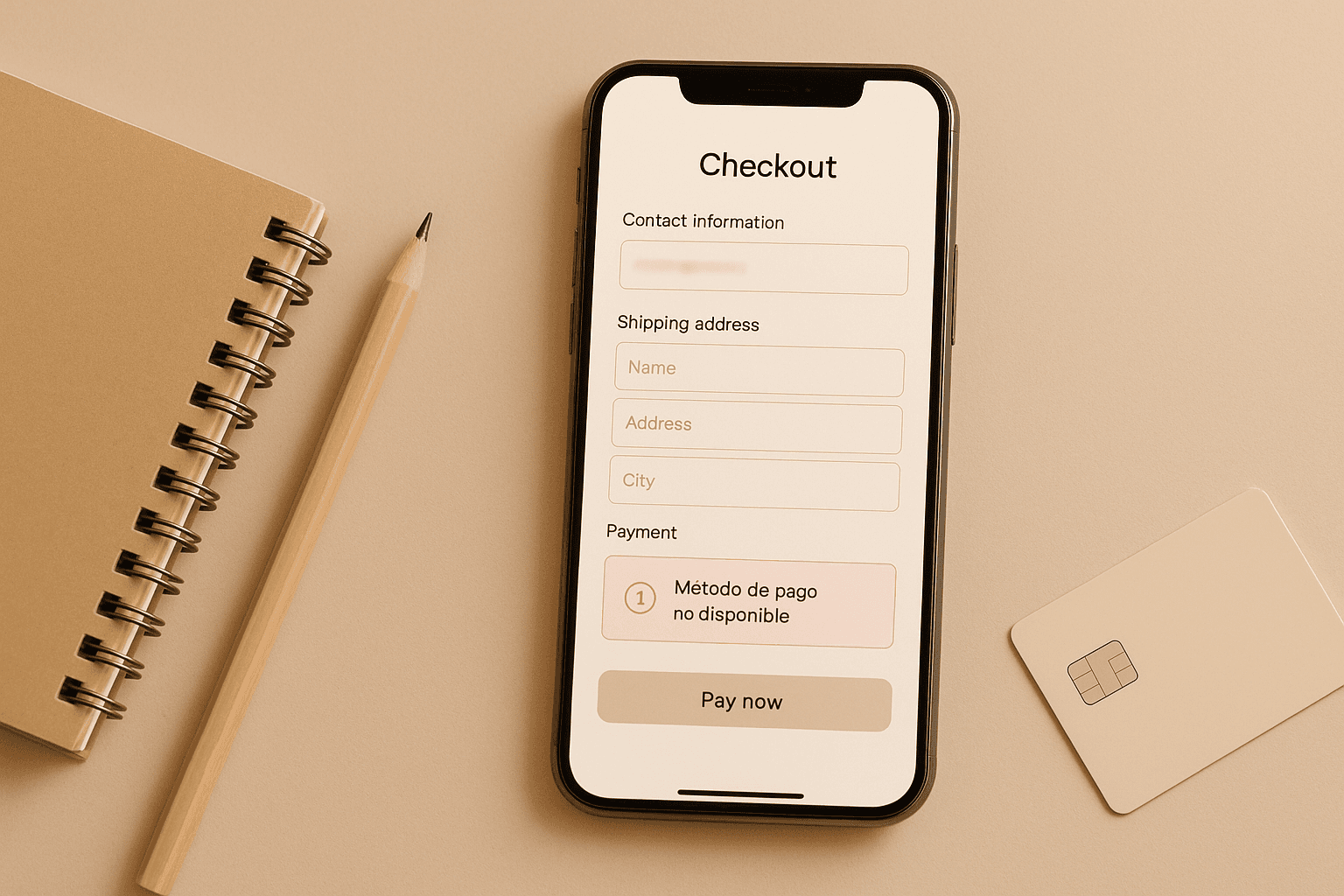
📉 Why checkout is where most sales are lost
Many analyses agree on something key: the greatest sales leakage occurs at the cart. It's the point where most people abandon the process before reaching the order confirmed screen. It is not always due to lack of interest. The most typical reasons:
Hidden costs that appear at the end
Long or confusing forms
Mandatory fields to fill out that create more friction
Few payment methods
Poor mobile usability
Technical errors that no one is monitoring
Let's take it to the physical world. Think of a supermarket where:
The line is endless
The POS fails every two minutes
No one explains why the price changed at the checkout
Would you stay? Probably not. You would leave and look for another store. Exactly the same happens in your checkout when the experience is not polished.
🔍 How to detect problems in your checkout
Before optimizing, you have to understand what is failing. Here are practical ideas based on what e-commerce businesses do that take the buying process seriously.
1. Go through the buying process yourself from start to finish
It seems obvious, but many e-commerce managers review everything except the checkout. Make a complete purchase as if you were a new customer:
Try different browsers
Repeat from a cell phone and from a computer
Test the different payment methods
Note any point where:
You doubt what to do
You don’t understand a message
You feel that everything loads slowly
If you notice friction, it will be worse for a customer who just met you.
A simple trick is to ask a family member or friend with little tech skill to try to buy. Ask them to speak aloud: what they understand, what they don’t, what makes them distrustful. It's a homemade version of a user test and reveals problems that you already take as “normal”.
2. Review pending, canceled, and failed orders
Your e-commerce platform and your payment gateways store a history of what happens with each purchase attempt. Check it frequently. Ask yourself:
How many orders are incomplete each day?
Is there a payment method that fails more than others?
Does the same rejection reason appear repeatedly?
Define a “normal” percentage of orders that are not completed. The day that rate spikes, you’ll know something is happening in your checkout and can react quicker.
3. Talk to users who left the purchase halfway
It sounds awkward, but it's one of the best shortcuts to understanding what happens in your checkout process. You can:
Call or write to a small sample of customers with incomplete orders
Ask in a helpful tone what happened in the process
Detect patterns: “it didn’t accept the payment”, “I didn’t understand the shipping cost”, “it kept loading”
Done right, the customer doesn’t see it as invasive. They feel there’s a real person behind trying to improve the experience.
4. Ask the customer service team
The support team usually detects failures on the payment page before anyone else because they directly receive the questions and frictions customers encounter in the buying process:
Customers confused about shipping costs
People who don’t understand how to pay
Users who say “it won’t let me complete the order”
Collect the most frequent questions related to the purchasing process. Each of those questions is a clue to something you should clarify or simplify directly in the checkout.
5. Review the purchasing funnel in your analytics
If you have the purchase process funnel configured, analytics show you where the process breaks down and help you detect patterns that aren’t always evident at a glance.
Where the most users drop off
If the drop-off is greater on mobile than on desktop
If there are issues associated with a specific browser
Quantitative analytics tell you what and where. The why is discovered with the previous steps and with user behavior tools.
6. Use session recordings to see what they really do
Recordings show you the real path of your users and reveal blocks that aren’t always detected with traditional analytics:
Where people click
Where they get stuck
On which form field they get trapped
If they try the same button multiple times without success
Review both the sessions that end in purchase and those that are left unfinished. You'll see what works well and where friction occurs.
🎯 10 proven tips to optimize your checkout
Now let’s move on to the practical part. These actions can be implemented in stages and measure their impact on your metrics.
1. Clear and no-surprise order summary
Your customer should know exactly what they're buying and how much they will pay:
Product photo and name
Size, color, or chosen variant
Quantity and unit price
Additional costs itemized
Final total visible and understandable
No hidden charges at the last step. Negative surprises are one of the main reasons for abandonment.
2. Don’t force account creation
Forcing registration at the checkout stage is like asking the customer to fill out a membership form when they’re already at the counter with the product in hand.
More friendly options:
Guest purchase
Create an account with one click after payment
Simplified registration using data the user has already entered
First, let them pay, then work on retention.
3. Remove unnecessary fields and steps
Every extra field is another friction. Review your form critically:
Do you really need all the data you ask for?
Can you use the browser's autocomplete?
Can you group steps on a single mobile screen?
The rule is simple: ask only what you need to bill and deliver.
4. Offer payment methods your customer already uses
It's not about having twenty options; it's about having the right ones for your market:
Local cards and well-known banks
Digital wallets and QR payments
Installment options if your average ticket is high
If the customer doesn’t see their favorite payment method at checkout, they’re much more likely to abandon.
5. Be transparent with costs from the start
Don’t hide the shipping cost or taxes.
Practical ideas:
Show an estimated shipping cost from the cart
Use a progress bar toward free shipping
Clarify if the price already includes taxes
Transparency reduces the psychological impact of an unexpected total.
6. Optimize for mobile first
In Latin America, most purchases are initiated or closed from mobile. Your checkout should work perfectly with the thumb:
Large, easy-to-click buttons
Forms that don’t require zooming
Proper keyboard for each field (numeric for card, for example)
Do the test: if you can’t complete your own store’s checkout with one hand from a mobile, there’s still work to do.
7. Improve loading times
An extra second at checkout can cost you many sales. Some simple actions:
Optimize images and scripts
Load only what's strictly necessary on the payment page
Avoid popups and heavy elements that distract or slow down
If the payment process feels slow, many customers prefer to leave before entering their data.
8. Use clear and consistent calls to action
Checkout buttons cannot be open to interpretation. Use texts like:
“Proceed to payment”
“Confirm order”
“Return to cart”
Avoid vague messages. The user should feel they understand what will happen when they click.
9. Offer real-time support without breaking the flow
A good practice is to integrate support right where the user may have doubts:
Visible WhatsApp link in checkout
Embedded chat
Mini section with frequently asked questions about payments and shipping
The key is for them to clear up a doubt without losing all the information they’ve already filled in.
This is where automation comes into play. With an AI assistant connected to WhatsApp, like those you can create with Yavendió!, the customer can resolve questions about payment methods, delivery times, or return policies while staying in the purchasing process, without depending on someone from the team being connected.
10. Use complementary sales without distracting from the objective
The checkout can help increase the average ticket, but it must do so with discretion.
Good use of cross-sell:
Offer truly complementary products
Present clear and easy-to-add recommendations
Don’t overwhelm with too many options
Remember that the main goal of the online store checkout is to close the sale. Everything that diverts focus from the pay button should be evaluated with care.
🤖 How to connect your checkout with WhatsApp and an AI seller

The checkout does not exist in isolation. It is the end of a journey that usually starts on social networks, paid campaigns, or short content.
If you connect your purchase process with an automated service system, you can:
Send direct payment links via WhatsApp to those who have decided to buy
Answer frequently asked questions without the customer having to leave the process
Recover abandoned carts with automated and personalized messages
With YaVendió! you can create an AI seller that:
Responds quickly when someone asks about price or stock
Shows catalogs and related products
Sends payment links to close the sale on WhatsApp
Records metrics to understand which conversations end in a sale
Thus, your checkout ceases to be a dead-end and becomes the natural close of a conversation that started much earlier.
🧭 Conclusion: the sale is decided at the checkout
The checkout is the final step of the customer's journey and, at the same time, one of the most neglected. A lot is invested in attracting visits, but little in reviewing how the most important moment is experienced: payment.
Optimizing it doesn't mean redoing your entire store. It means:
Understanding where people are dropping off
Removing unnecessary frictions
Being transparent with costs and times
Facilitating payment with the methods your customer already uses
Providing support and automation when needed
If you combine a clear and fast checkout with an AI assistant that attends via WhatsApp, your ads, your content, and campaigns no longer work alone. Each visit has more chances of becoming a real sale.
In a market where everyone can set up an online store, the difference is no longer who has more traffic, but who ensures that more people reach the “order confirmed”. 💸
With tools like Yavendió!, you can connect checkout with WhatsApp, automate service, recover abandoned carts, and convert more sales without complicating your operation.

In a physical store, the sale is decided at the checkout. In an online store, that moment occurs at the checkout, where the customer confirms their order and makes the final decision to pay.
You can invest in traffic, ads, influencers, and branding, but if this section does not work well, all that effort ends up in abandoned carts. When a person reaches the payment section, it means they have overcome all the difficult parts: they found your store, compared options, and decided what they want to buy. If they abandon right there, you are not just losing a visitor; you are losing someone who was ready to become a customer.
Various sources estimate that between 65 and 85% of online store traffic ends in abandoned carts. On average, seven out of ten people who visit an online store do not complete their purchase. You can see variations by industry, country, and payment method, but the conclusion is the same: abandonment on the payment page represents thousands or millions in lost sales every year.
The good news is that with good practices and specific adjustments to your payment process, you can significantly reduce that abandonment. It all starts with understanding where people leave, why it happens, and what you can optimize so that more visitors reach the “order confirmed” button.
🧾 What is checkout in your online store
Technically, the checkout is the page or set of screens where the customer completes the purchase. From a business perspective, it's the final stretch of the journey before the money reaches your account.
In an online store checkout, the following typically appear:
Personal and contact details
Shipping address
Delivery options
Payment methods
Order summary (selected products)
Confirmation button and success screen
In a physical store, it would be the checkout counter. The customer has already chosen the product, advanced with the cart and only needs to pay.
The difference is that in the digital environment you don't see the line, you don't see the person hesitate, you don't see them turn around and leave. You only see the conversion rate not rising and your abandoned cart rate remaining high.
📉 Why checkout is where most sales are lost
Many analyses agree on something key: the greatest sales leakage occurs at the cart. It's the point where most people abandon the process before reaching the order confirmed screen. It is not always due to lack of interest. The most typical reasons:
Hidden costs that appear at the end
Long or confusing forms
Mandatory fields to fill out that create more friction
Few payment methods
Poor mobile usability
Technical errors that no one is monitoring
Let's take it to the physical world. Think of a supermarket where:
The line is endless
The POS fails every two minutes
No one explains why the price changed at the checkout
Would you stay? Probably not. You would leave and look for another store. Exactly the same happens in your checkout when the experience is not polished.
🔍 How to detect problems in your checkout
Before optimizing, you have to understand what is failing. Here are practical ideas based on what e-commerce businesses do that take the buying process seriously.
1. Go through the buying process yourself from start to finish
It seems obvious, but many e-commerce managers review everything except the checkout. Make a complete purchase as if you were a new customer:
Try different browsers
Repeat from a cell phone and from a computer
Test the different payment methods
Note any point where:
You doubt what to do
You don’t understand a message
You feel that everything loads slowly
If you notice friction, it will be worse for a customer who just met you.
A simple trick is to ask a family member or friend with little tech skill to try to buy. Ask them to speak aloud: what they understand, what they don’t, what makes them distrustful. It's a homemade version of a user test and reveals problems that you already take as “normal”.
2. Review pending, canceled, and failed orders
Your e-commerce platform and your payment gateways store a history of what happens with each purchase attempt. Check it frequently. Ask yourself:
How many orders are incomplete each day?
Is there a payment method that fails more than others?
Does the same rejection reason appear repeatedly?
Define a “normal” percentage of orders that are not completed. The day that rate spikes, you’ll know something is happening in your checkout and can react quicker.
3. Talk to users who left the purchase halfway
It sounds awkward, but it's one of the best shortcuts to understanding what happens in your checkout process. You can:
Call or write to a small sample of customers with incomplete orders
Ask in a helpful tone what happened in the process
Detect patterns: “it didn’t accept the payment”, “I didn’t understand the shipping cost”, “it kept loading”
Done right, the customer doesn’t see it as invasive. They feel there’s a real person behind trying to improve the experience.
4. Ask the customer service team
The support team usually detects failures on the payment page before anyone else because they directly receive the questions and frictions customers encounter in the buying process:
Customers confused about shipping costs
People who don’t understand how to pay
Users who say “it won’t let me complete the order”
Collect the most frequent questions related to the purchasing process. Each of those questions is a clue to something you should clarify or simplify directly in the checkout.
5. Review the purchasing funnel in your analytics
If you have the purchase process funnel configured, analytics show you where the process breaks down and help you detect patterns that aren’t always evident at a glance.
Where the most users drop off
If the drop-off is greater on mobile than on desktop
If there are issues associated with a specific browser
Quantitative analytics tell you what and where. The why is discovered with the previous steps and with user behavior tools.
6. Use session recordings to see what they really do
Recordings show you the real path of your users and reveal blocks that aren’t always detected with traditional analytics:
Where people click
Where they get stuck
On which form field they get trapped
If they try the same button multiple times without success
Review both the sessions that end in purchase and those that are left unfinished. You'll see what works well and where friction occurs.
🎯 10 proven tips to optimize your checkout
Now let’s move on to the practical part. These actions can be implemented in stages and measure their impact on your metrics.
1. Clear and no-surprise order summary
Your customer should know exactly what they're buying and how much they will pay:
Product photo and name
Size, color, or chosen variant
Quantity and unit price
Additional costs itemized
Final total visible and understandable
No hidden charges at the last step. Negative surprises are one of the main reasons for abandonment.
2. Don’t force account creation
Forcing registration at the checkout stage is like asking the customer to fill out a membership form when they’re already at the counter with the product in hand.
More friendly options:
Guest purchase
Create an account with one click after payment
Simplified registration using data the user has already entered
First, let them pay, then work on retention.
3. Remove unnecessary fields and steps
Every extra field is another friction. Review your form critically:
Do you really need all the data you ask for?
Can you use the browser's autocomplete?
Can you group steps on a single mobile screen?
The rule is simple: ask only what you need to bill and deliver.
4. Offer payment methods your customer already uses
It's not about having twenty options; it's about having the right ones for your market:
Local cards and well-known banks
Digital wallets and QR payments
Installment options if your average ticket is high
If the customer doesn’t see their favorite payment method at checkout, they’re much more likely to abandon.
5. Be transparent with costs from the start
Don’t hide the shipping cost or taxes.
Practical ideas:
Show an estimated shipping cost from the cart
Use a progress bar toward free shipping
Clarify if the price already includes taxes
Transparency reduces the psychological impact of an unexpected total.
6. Optimize for mobile first
In Latin America, most purchases are initiated or closed from mobile. Your checkout should work perfectly with the thumb:
Large, easy-to-click buttons
Forms that don’t require zooming
Proper keyboard for each field (numeric for card, for example)
Do the test: if you can’t complete your own store’s checkout with one hand from a mobile, there’s still work to do.
7. Improve loading times
An extra second at checkout can cost you many sales. Some simple actions:
Optimize images and scripts
Load only what's strictly necessary on the payment page
Avoid popups and heavy elements that distract or slow down
If the payment process feels slow, many customers prefer to leave before entering their data.
8. Use clear and consistent calls to action
Checkout buttons cannot be open to interpretation. Use texts like:
“Proceed to payment”
“Confirm order”
“Return to cart”
Avoid vague messages. The user should feel they understand what will happen when they click.
9. Offer real-time support without breaking the flow
A good practice is to integrate support right where the user may have doubts:
Visible WhatsApp link in checkout
Embedded chat
Mini section with frequently asked questions about payments and shipping
The key is for them to clear up a doubt without losing all the information they’ve already filled in.
This is where automation comes into play. With an AI assistant connected to WhatsApp, like those you can create with Yavendió!, the customer can resolve questions about payment methods, delivery times, or return policies while staying in the purchasing process, without depending on someone from the team being connected.
10. Use complementary sales without distracting from the objective
The checkout can help increase the average ticket, but it must do so with discretion.
Good use of cross-sell:
Offer truly complementary products
Present clear and easy-to-add recommendations
Don’t overwhelm with too many options
Remember that the main goal of the online store checkout is to close the sale. Everything that diverts focus from the pay button should be evaluated with care.
🤖 How to connect your checkout with WhatsApp and an AI seller
The checkout does not exist in isolation. It is the end of a journey that usually starts on social networks, paid campaigns, or short content.
If you connect your purchase process with an automated service system, you can:
Send direct payment links via WhatsApp to those who have decided to buy
Answer frequently asked questions without the customer having to leave the process
Recover abandoned carts with automated and personalized messages
With YaVendió! you can create an AI seller that:
Responds quickly when someone asks about price or stock
Shows catalogs and related products
Sends payment links to close the sale on WhatsApp
Records metrics to understand which conversations end in a sale
Thus, your checkout ceases to be a dead-end and becomes the natural close of a conversation that started much earlier.
🧭 Conclusion: the sale is decided at the checkout
The checkout is the final step of the customer's journey and, at the same time, one of the most neglected. A lot is invested in attracting visits, but little in reviewing how the most important moment is experienced: payment.
Optimizing it doesn't mean redoing your entire store. It means:
Understanding where people are dropping off
Removing unnecessary frictions
Being transparent with costs and times
Facilitating payment with the methods your customer already uses
Providing support and automation when needed
If you combine a clear and fast checkout with an AI assistant that attends via WhatsApp, your ads, your content, and campaigns no longer work alone. Each visit has more chances of becoming a real sale.
In a market where everyone can set up an online store, the difference is no longer who has more traffic, but who ensures that more people reach the “order confirmed”. 💸
With tools like Yavendió!, you can connect checkout with WhatsApp, automate service, recover abandoned carts, and convert more sales without complicating your operation.
Dec 10, 2025


Bring the magic to your sales TODAY!
Get a demo

Bring the magic to your sales TODAY!
Get a demo
@2024 YA VENDIO - All rights reserved
@2024 YA VENDIO - All rights reserved
