Meet Yago, your business partner on WhatsApp
Meet Yago, your business partner on WhatsApp
Sep 27, 2025
How to create product pages that convert
Keys to structure, text, and trust to skyrocket your conversions.
Silvana Cabrera
When you launch a campaign on social media and visits to your online store start to grow, the excitement is enormous. You feel that all your effort in advertising and content is starting to pay off and that sales are about to take off.
But when you review the orders, the excitement turns into frustration. Carts are abandoned and, despite the traffic, purchases don't happen. In a matter of seconds, it seems like all the work was lost.
Does this sound familiar? If you have an e-commerce, you have surely experienced it more than once.
The truth is that the problem is not always with the ads nor the social media strategy. Often, the bottleneck appears at a critical point: your product page.
When that page does not convey trust, when the texts do not connect, or when the design creates doubts, visitors leave without buying.
The good news is that there is a way out. In this article, I am going to show you how to transform your product pages into true digital sellers. I'll tell you what structure works best, how to write descriptions that arouse desire, how storytelling can increase interest, and what trust elements remove friction at key moments.

💖 The product page is the heart of e-commerce
An effective product page not only shows what you are selling, it also informs, persuades, and conveys trust. That is the difference between having visitors who leave without buying and achieving customers who complete the purchase.
It is not enough to upload photos and set the price. Every detail matters: the order in which you present the information, the clarity of the texts, and how you accompany the user in their decision. The key is to guide them in a simple and convincing journey that leads them, step by step, to click “buy”.
What cannot be missing on a product page
Every detail of your product page influences the purchase decision. It's not about filling space, but including the elements that generate trust and lead the customer directly to click the “buy” button. These are the basics that cannot be missing:
What cannot be missing on a product page
Every detail of your product page influences the purchase decision. It's not about filling space, but including the elements that generate trust and lead the customer directly to click the “buy” button. These are the basics that cannot be missing:
✍️ Clear and benefit-oriented title
The customer must understand in seconds what the product is and why they need it.
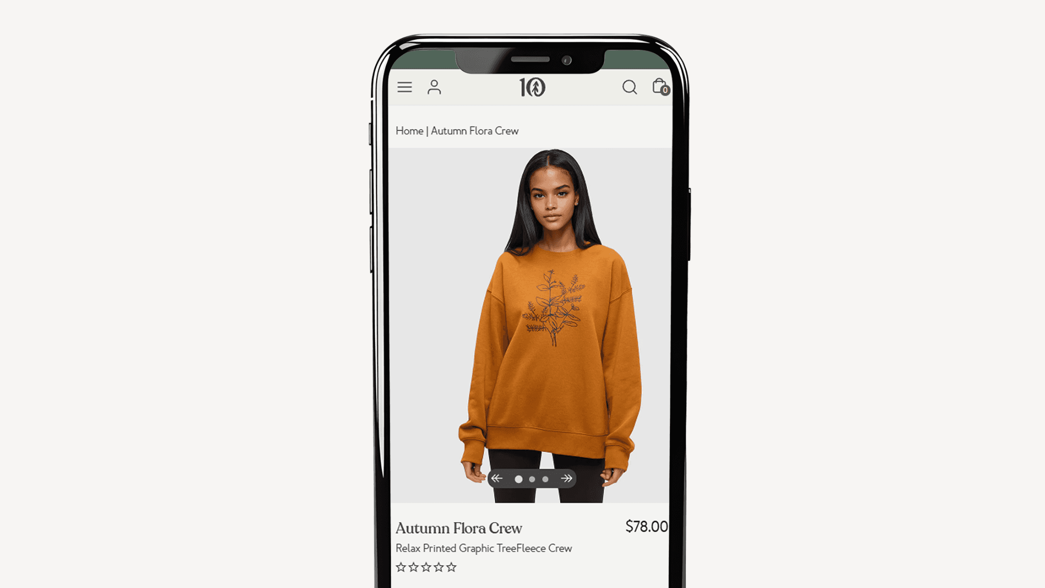
📸🎥 Quality images and videos
Nothing connects more than seeing the product in action. Show how it is used in real life so the customer can imagine it in theirs.
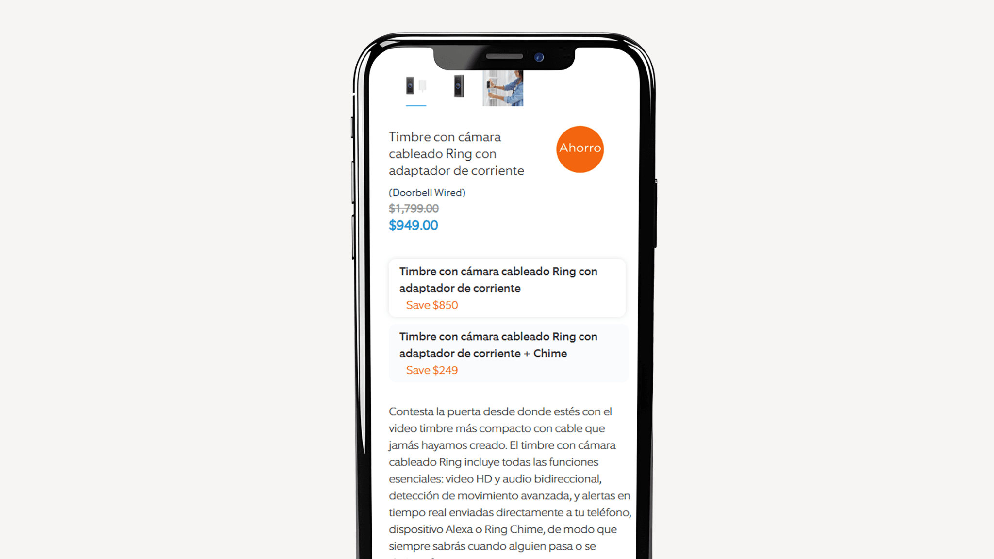
💲 Visible price and promotions
It's a mistake to hide key information. If the customer has to search too much, they leave.
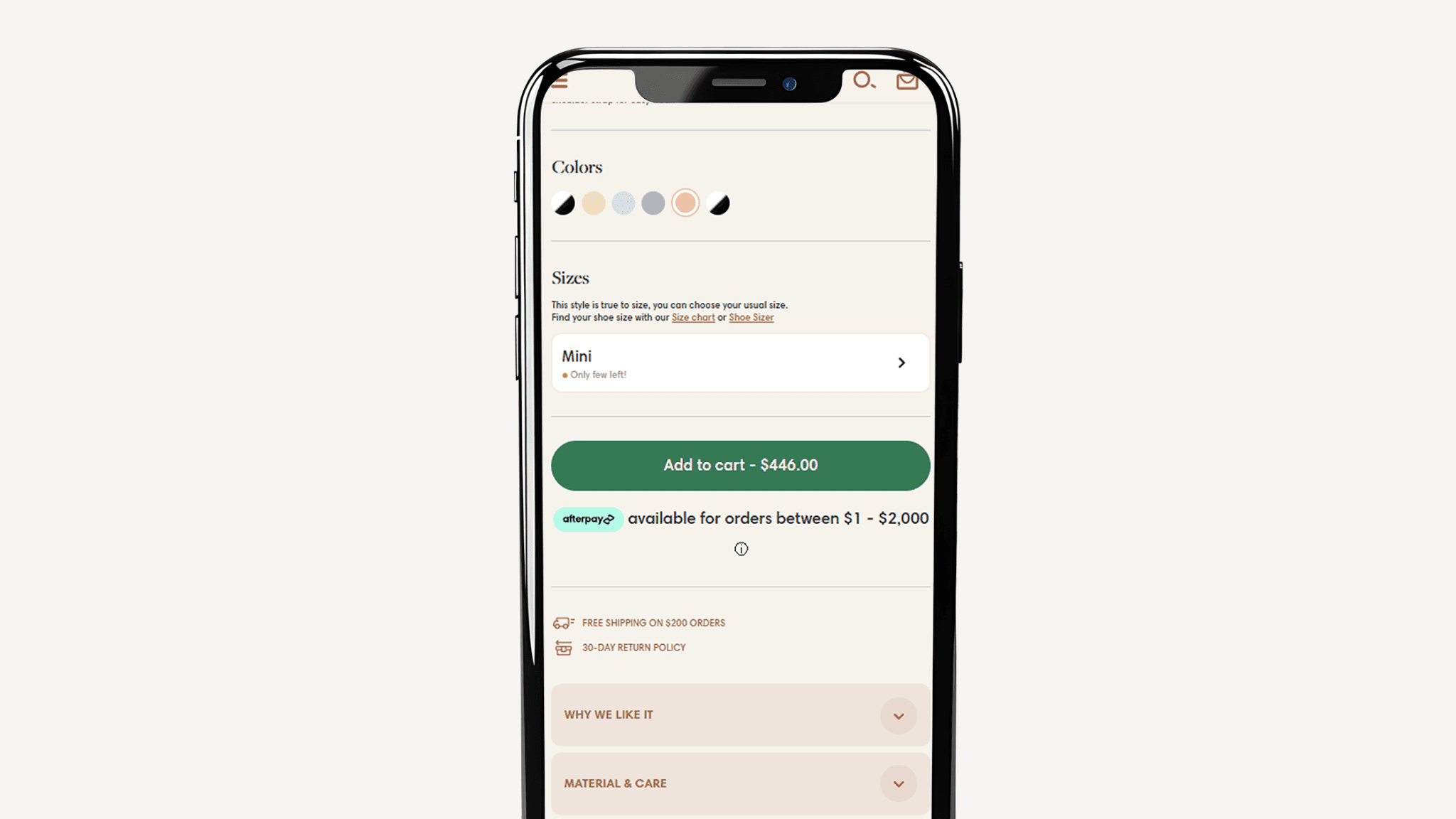
🔘 Highlighted CTA
The buy button must always be accessible, with a direct and actionable text inviting the next step.
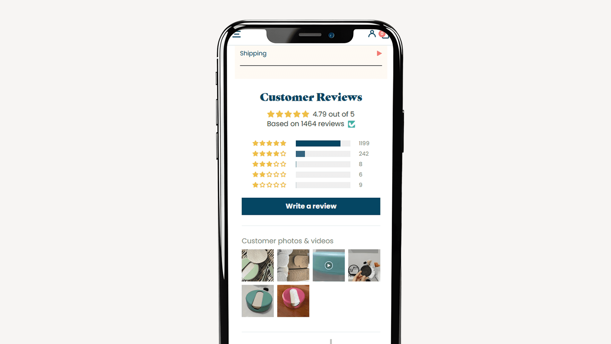
⭐ Reviews and ratings
Social proof is powerful. Other customers' opinions convey more trust than any sales argument.
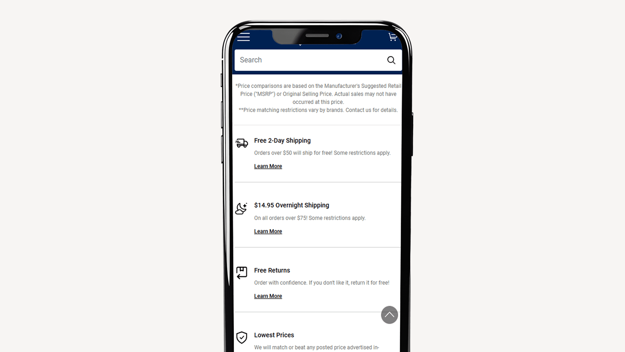
📦 Clear shipping and return policies
They reduce the fear of making mistakes and show the customer they are not at risk.
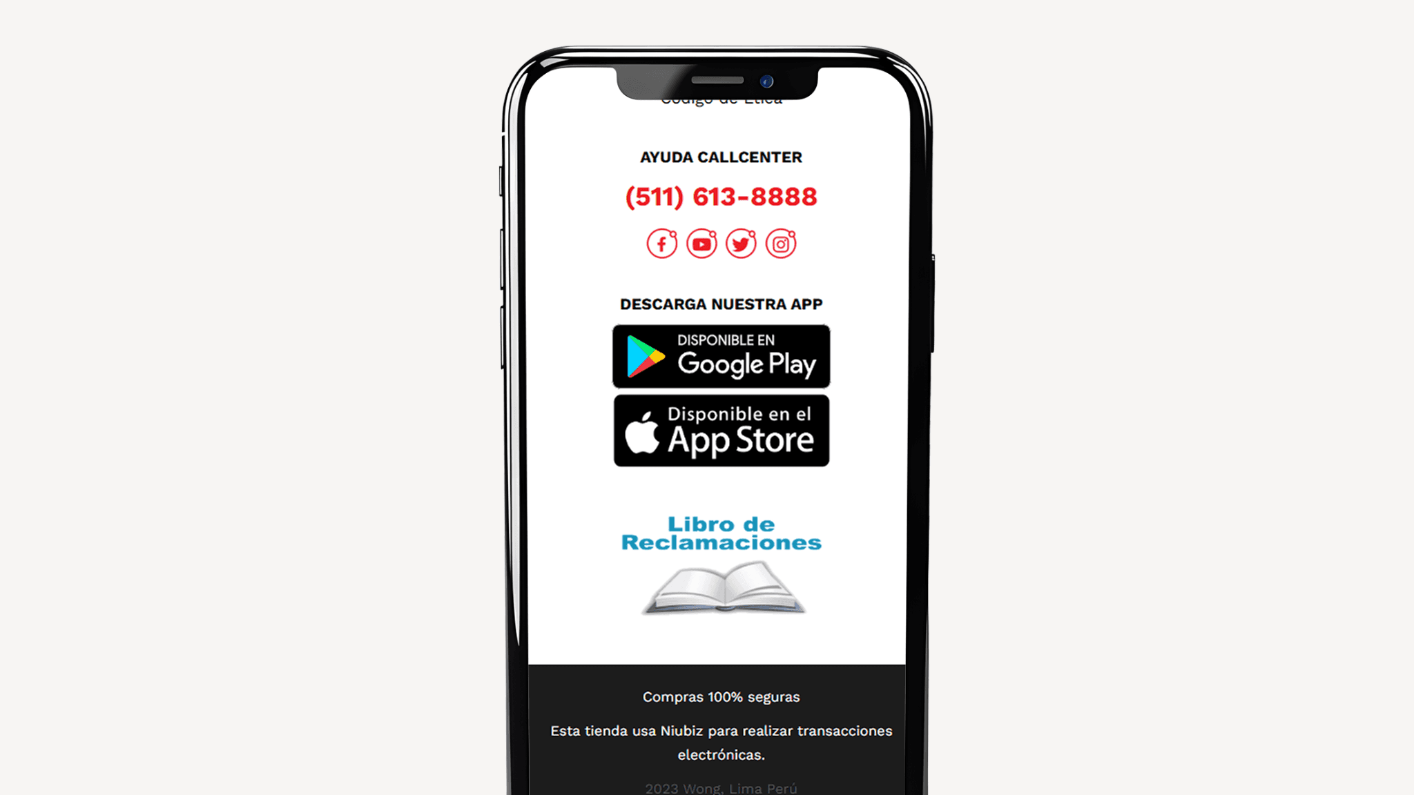
🔒 Security seals and reliable payment methods
These are small details that make a difference at the moment of deciding.
How to guide the customer to the purchase
A technical sheet only informs, but a good description converts. The key is to translate cold data into benefits that the customer can imagine in their daily lives. That is micro-storytelling: showing how the product solves a real problem or satisfies a specific desire.
A simple scheme to achieve this:
✨ Problem – what need does the product cover.
💡 Benefit – how it solves it and what the customer gains.
✅ Proof – materials, data, or reviews that reinforce trust.
👉 Action – a clear call to the buy click.
Practical example: instead of saying “Ergonomic chair with adjustable backrest”, write “Backrest that adapts to your posture and helps you work more hours without back pain”. It's direct, easy to visualize, and conveys immediate value.
Calls to action (CTA) that really convert
A CTA in e-commerce is not just a button with the word “Buy”. It's the closure of the entire page journey, the decisive moment where the customer must feel confident to click.
The text not only invites action, it also reduces frictions and reinforces benefits. Therefore, the best CTAs combine urgency, clarity, and trust.
Effective examples:
“Buy now and receive in 24h 🚚” → generates urgency with a specific benefit (fast delivery).
“Add to cart with free return” → conveys security by minimizing purchase risk.
“Try it risk-free for 15 days” → eliminates objections and encourages deciding without fear of losing money.
The trust factor: what your customers need to see before buying
Buying online always involves uncertainty. Therefore, each product page must convey security at all times. Trust is not achieved with a single detail, but with several elements that, together, reinforce the credibility of your store.
⭐ Visible reviews
It's not just about stars. The most useful opinions are those that answer real doubts: sizes, compatibility, durability, or ease of use.
📦 Clear policies
Returns, exchanges, and delivery times explained in simple sentences. When the customer knows what will happen if something goes wrong, they buy with more peace of mind.
🔒 Trusted seals and payment methods
Seeing well-known logos like Visa, Mastercard, PayPal, or local banks reduces barriers and confirms the transaction is secure.
In summary: sales are not closed just with a good price or an attractive photo, but when the customer feels they are protected and can trust your brand.
How to increase the conversion rate on product pages
Optimization is a constant process. Here are some e-commerce practices that can make a difference in your conversion rate:
🎥 Demonstrative videos in the first scroll
They show the product in action and visually answer many doubts before the customer even asks.
🤖 AI assistants like Yavendió!
They respond to queries in real-time, recommend products, and even send direct payment links in the chat.
📱 Mobile optimization
In LATAM, most purchases occur from cell phones. A slow or disorganized mobile page is a lost sale.
⏳ Urgency and scarcity
Timers, limited stock messages, or promotions with a defined time motivate faster decisions.
These actions can increase conversion even without increasing traffic.
Conclusion
Optimizing the product page is not a secondary detail, it's the core of online sales. Every word, every image, and every trust signal are the small pushes that lead the customer to click “Buy now”.
When you also integrate tools like Yavendió!, with a WhatsApp virtual assistant that answers questions in seconds, eliminates objections, and sends direct payment links in the chat, the impact multiplies: you convert more without needing to spend more on advertising.
👉 If you want to grow your e-commerce, start here. Your product pages are, in fact, your best digital salesman available 24/7.
FAQ
What is the difference between features and benefits in a product description?
Features inform what the product has; benefits explain what they do for the customer.
How many reviews do I need to build trust?
It's not so much about the number but the relevance: a review that answers common doubts is worth more than ten generic ones.
Where to place the CTA on a product page?
Always visible: at the top, halfway through the scroll and at the end, ensuring the user never loses sight of it.
How do I know if my product page is optimized?
Measure the conversion rate and do A/B testing on titles, CTAs, and descriptions. If conversion improves without changing traffic, you're on the right track.
When you launch a campaign on social media and visits to your online store start to grow, the excitement is enormous. You feel that all your effort in advertising and content is starting to pay off and that sales are about to take off.
But when you review the orders, the excitement turns into frustration. Carts are abandoned and, despite the traffic, purchases don't happen. In a matter of seconds, it seems like all the work was lost.
Does this sound familiar? If you have an e-commerce, you have surely experienced it more than once.
The truth is that the problem is not always with the ads nor the social media strategy. Often, the bottleneck appears at a critical point: your product page.
When that page does not convey trust, when the texts do not connect, or when the design creates doubts, visitors leave without buying.
The good news is that there is a way out. In this article, I am going to show you how to transform your product pages into true digital sellers. I'll tell you what structure works best, how to write descriptions that arouse desire, how storytelling can increase interest, and what trust elements remove friction at key moments.
💖 The product page is the heart of e-commerce
An effective product page not only shows what you are selling, it also informs, persuades, and conveys trust. That is the difference between having visitors who leave without buying and achieving customers who complete the purchase.
It is not enough to upload photos and set the price. Every detail matters: the order in which you present the information, the clarity of the texts, and how you accompany the user in their decision. The key is to guide them in a simple and convincing journey that leads them, step by step, to click “buy”.
What cannot be missing on a product page
Every detail of your product page influences the purchase decision. It's not about filling space, but including the elements that generate trust and lead the customer directly to click the “buy” button. These are the basics that cannot be missing:
What cannot be missing on a product page
Every detail of your product page influences the purchase decision. It's not about filling space, but including the elements that generate trust and lead the customer directly to click the “buy” button. These are the basics that cannot be missing:
✍️ Clear and benefit-oriented title
The customer must understand in seconds what the product is and why they need it.
📸🎥 Quality images and videos
Nothing connects more than seeing the product in action. Show how it is used in real life so the customer can imagine it in theirs.
💲 Visible price and promotions
It's a mistake to hide key information. If the customer has to search too much, they leave.
🔘 Highlighted CTA
The buy button must always be accessible, with a direct and actionable text inviting the next step.
⭐ Reviews and ratings
Social proof is powerful. Other customers' opinions convey more trust than any sales argument.
📦 Clear shipping and return policies
They reduce the fear of making mistakes and show the customer they are not at risk.
🔒 Security seals and reliable payment methods
These are small details that make a difference at the moment of deciding.
How to guide the customer to the purchase
A technical sheet only informs, but a good description converts. The key is to translate cold data into benefits that the customer can imagine in their daily lives. That is micro-storytelling: showing how the product solves a real problem or satisfies a specific desire.
A simple scheme to achieve this:
✨ Problem – what need does the product cover.
💡 Benefit – how it solves it and what the customer gains.
✅ Proof – materials, data, or reviews that reinforce trust.
👉 Action – a clear call to the buy click.
Practical example: instead of saying “Ergonomic chair with adjustable backrest”, write “Backrest that adapts to your posture and helps you work more hours without back pain”. It's direct, easy to visualize, and conveys immediate value.
Calls to action (CTA) that really convert
A CTA in e-commerce is not just a button with the word “Buy”. It's the closure of the entire page journey, the decisive moment where the customer must feel confident to click.
The text not only invites action, it also reduces frictions and reinforces benefits. Therefore, the best CTAs combine urgency, clarity, and trust.
Effective examples:
“Buy now and receive in 24h 🚚” → generates urgency with a specific benefit (fast delivery).
“Add to cart with free return” → conveys security by minimizing purchase risk.
“Try it risk-free for 15 days” → eliminates objections and encourages deciding without fear of losing money.
The trust factor: what your customers need to see before buying
Buying online always involves uncertainty. Therefore, each product page must convey security at all times. Trust is not achieved with a single detail, but with several elements that, together, reinforce the credibility of your store.
⭐ Visible reviews
It's not just about stars. The most useful opinions are those that answer real doubts: sizes, compatibility, durability, or ease of use.
📦 Clear policies
Returns, exchanges, and delivery times explained in simple sentences. When the customer knows what will happen if something goes wrong, they buy with more peace of mind.
🔒 Trusted seals and payment methods
Seeing well-known logos like Visa, Mastercard, PayPal, or local banks reduces barriers and confirms the transaction is secure.
In summary: sales are not closed just with a good price or an attractive photo, but when the customer feels they are protected and can trust your brand.
How to increase the conversion rate on product pages
Optimization is a constant process. Here are some e-commerce practices that can make a difference in your conversion rate:
🎥 Demonstrative videos in the first scroll
They show the product in action and visually answer many doubts before the customer even asks.
🤖 AI assistants like Yavendió!
They respond to queries in real-time, recommend products, and even send direct payment links in the chat.
📱 Mobile optimization
In LATAM, most purchases occur from cell phones. A slow or disorganized mobile page is a lost sale.
⏳ Urgency and scarcity
Timers, limited stock messages, or promotions with a defined time motivate faster decisions.
These actions can increase conversion even without increasing traffic.
Conclusion
Optimizing the product page is not a secondary detail, it's the core of online sales. Every word, every image, and every trust signal are the small pushes that lead the customer to click “Buy now”.
When you also integrate tools like Yavendió!, with a WhatsApp virtual assistant that answers questions in seconds, eliminates objections, and sends direct payment links in the chat, the impact multiplies: you convert more without needing to spend more on advertising.
👉 If you want to grow your e-commerce, start here. Your product pages are, in fact, your best digital salesman available 24/7.
FAQ
What is the difference between features and benefits in a product description?
Features inform what the product has; benefits explain what they do for the customer.
How many reviews do I need to build trust?
It's not so much about the number but the relevance: a review that answers common doubts is worth more than ten generic ones.
Where to place the CTA on a product page?
Always visible: at the top, halfway through the scroll and at the end, ensuring the user never loses sight of it.
How do I know if my product page is optimized?
Measure the conversion rate and do A/B testing on titles, CTAs, and descriptions. If conversion improves without changing traffic, you're on the right track.
Sep 27, 2025


Bring the magic to your sales TODAY!
Get a demo

Bring the magic to your sales TODAY!
Get a demo
@2024 YA VENDIO - All rights reserved
@2024 YA VENDIO - All rights reserved
